Here are a few things I’ve noticed playing around with the final version of StoreFront 3.0 released to the public last week when upgrading a StoreFront 2.6 environment. I spent some time messing around with StoreFront 2.7 Tech Preview customization and if you look at the code there are several changes. None of these things I’ve noticed with 3.0 are show stoppers, just minor gotchas to lookout for and some workarounds I’ve done so far. I want to say the upgrade from 2.6 to 3.0 in the 2 environments I’ve done so far was actually very smooth. Very impressed with the StoreFront Development team on this upgrade process and StoreFront 3.0 as a whole! 🙂
Here are the items I’ve come across so far during the StoreFront 2.6 to 3.0 upgrade and their workarounds:
Read on for explanation of each. I’ll try to add more as I come across them.
MMC crash in 2008 R2
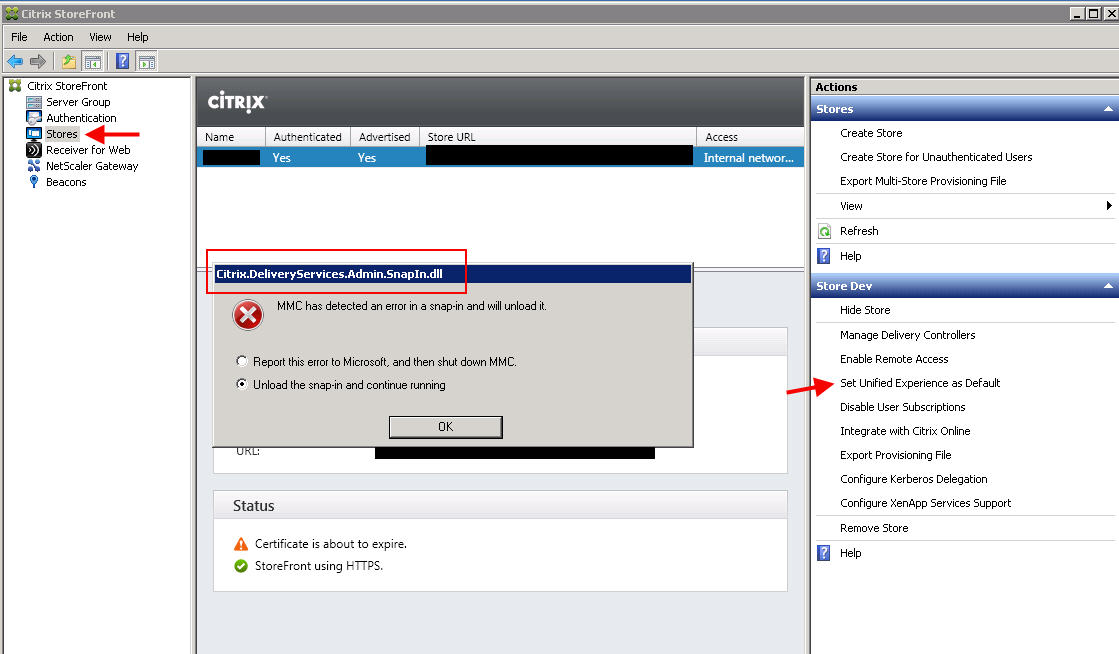
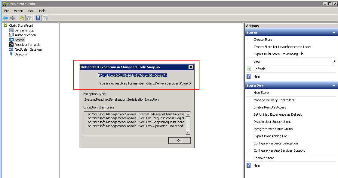
If using Server 2008 R2 the Citrix StoreFront console MMC might crash if you try to “Set Unified Experience as Default” under the Stores first. Specifically the “Citrix.DeliveryServices.Admin.SnapIn.dll” crashes:
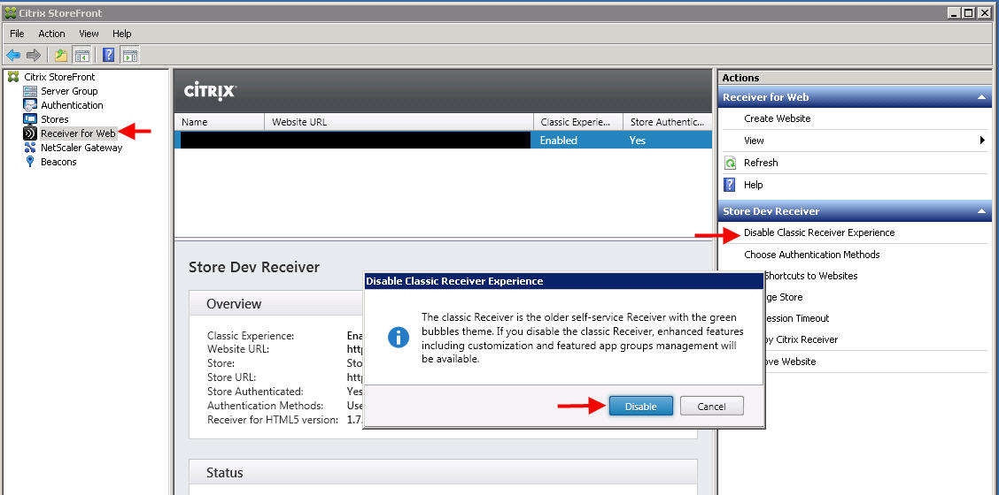
You MUST go to “Receiver for Web” and Disable Classic Receiver Experience first. This is even recommended by Feng Huang in his What’s New in StoreFront 3.0 article but the MMC crash is unexpected. My gut feeling is that is has to do with the OS and dependencies (PowerShell, .NET, etc.) in this particular environment. I have submitted Process Monitor captures to Citrix Support to kick it up to the dev team. It’s not a big deal, just be aware of this error if you don’t follow the right order. I prefer Server 2012 R2 for all newer Citrix products but sometimes you don’t control what environment your client has:
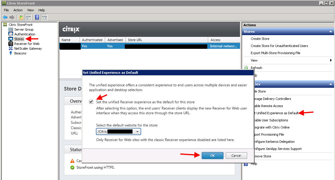
Now go back to Stores and try to “Set Unified Experience as Default”. It will come up with no issue and you can set the new experience:
Desktop shortcut breaks
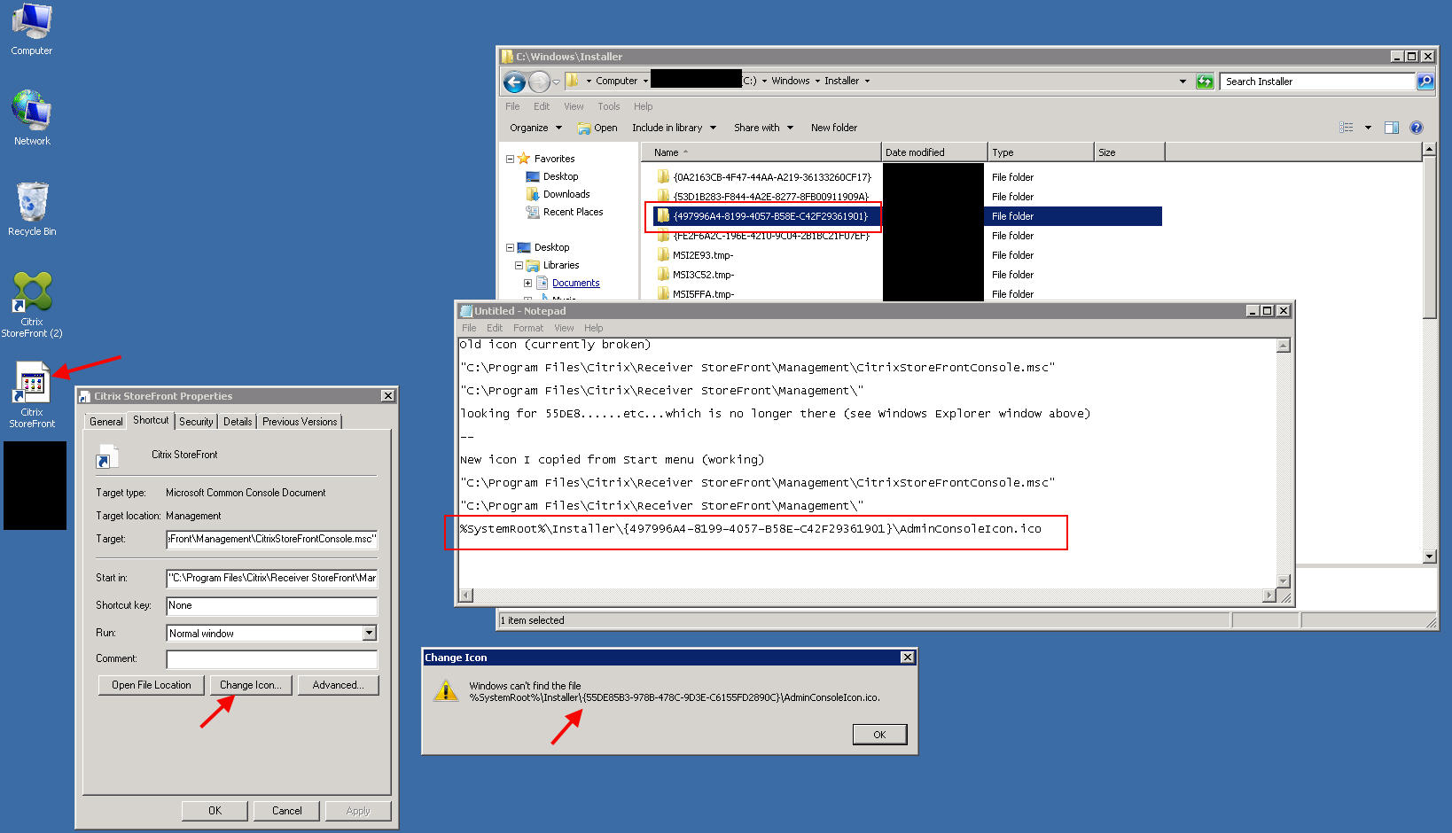
The desktop icon will break due to the installer changing (but the icon will still function normally). Just send a new icon from your Start menu to the Desktop to fix it. You can check the icon location of the old vs. the new to see exactly what happened. I’ve included some notes in the screenshot below. The .ico file is no longer in the specified GUID folder because it was deleted by the StoreFront 3.0 installer:
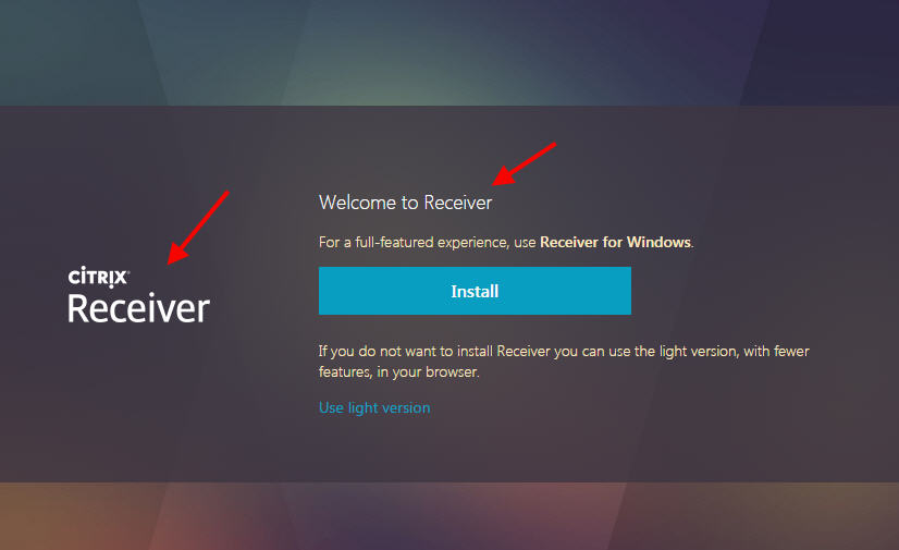
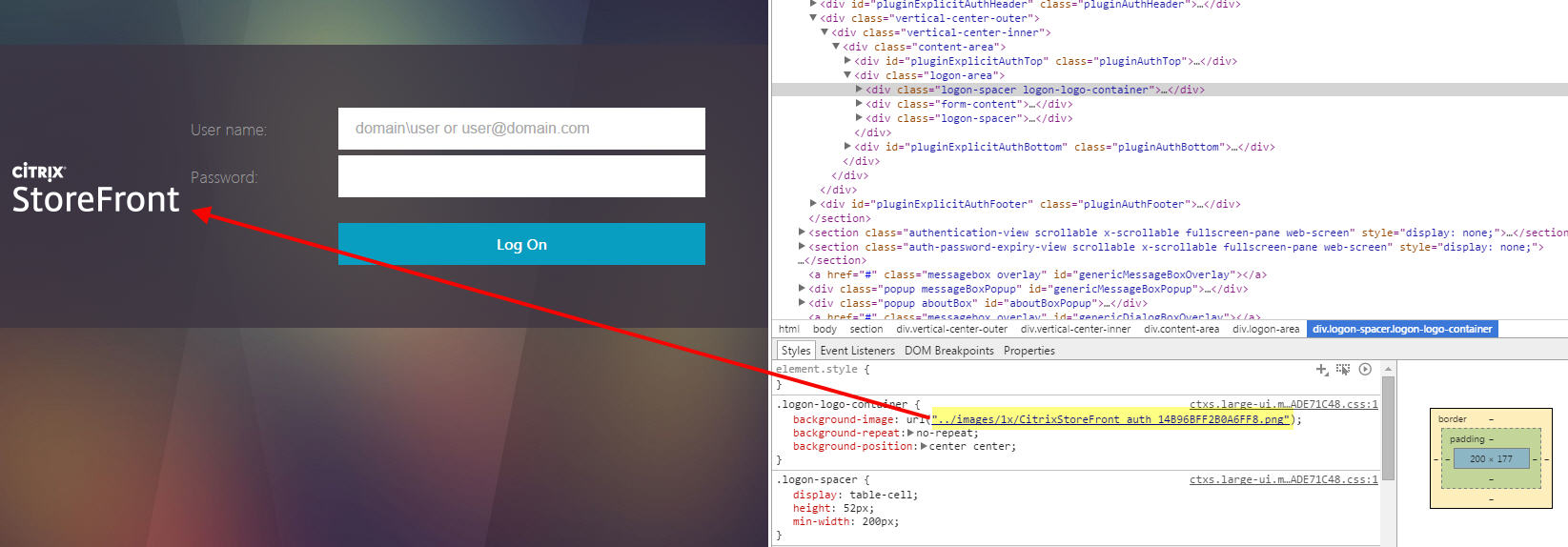
Logos say “Citrix StoreFront” instead of “Citrix Receiver”
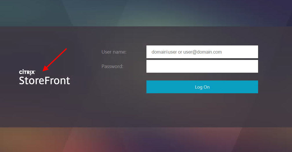
Your logon and header logos might show “Citrix StoreFront” after the upgrade:
You’ll notice in the Console that is the default:
Looks way different than 2.7, right?
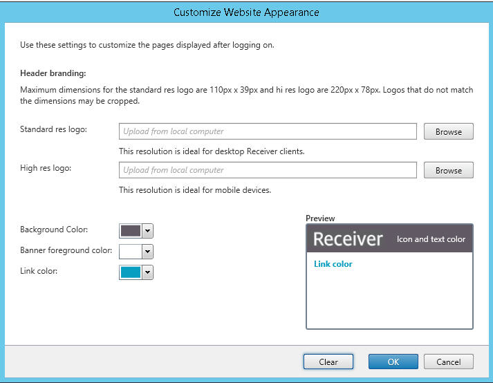
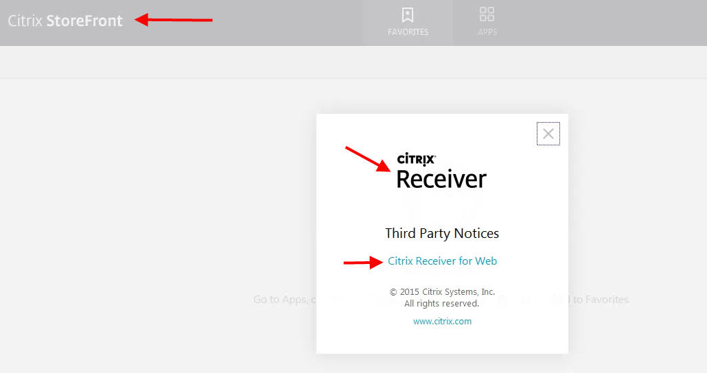
I love the simplification of the admin console from 2.7 to 3.0 for people who are not familiar with web architecture and 2x images/Retina Ready requirements. Much more streamlined. I’m not sure why the decision was made to change from the word “Receiver” to “StoreFront” in 3.0 however. If you are used to seeing Citrix Receiver with the classic Green Bubbles theme in both web and the Receiver app, all of a sudden seeing the word “StoreFront” can be a little alarming to end users. Even the About, logoff, and client detection branding all still says Citrix Receiver so this will cause a fractured user experience having 2 names for the same thing:
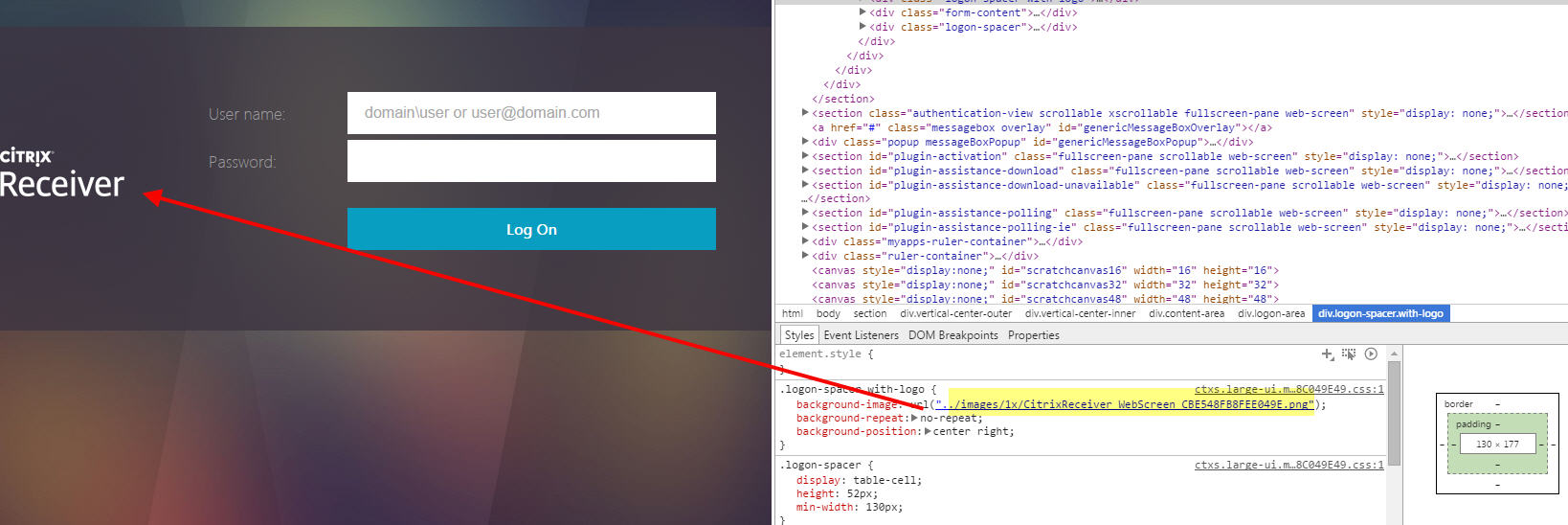
The fix is to change the logon and header logos back to “Citrix Receiver” which I found is not as easy as it seems. By default in StoreFront 3.0, it is using these two .png files to create the logon and header logos if you look at the source code of the pages:
Logon branding logo – 175px x 52px:
|
1 |
https://yourdomain.com/Citrix/StoreWeb/receiver/images/1x/CitrixStoreFront_auth_14B96BFF2B0A6FF8.png |
Header branding (Post logon) – 169px x 21px:
|
1 |
https://yourdomain.com/Citrix/StoreWeb/receiver/images/1x/CitrixReceiverLogo_Home_5C24BCEC5A182425.png |
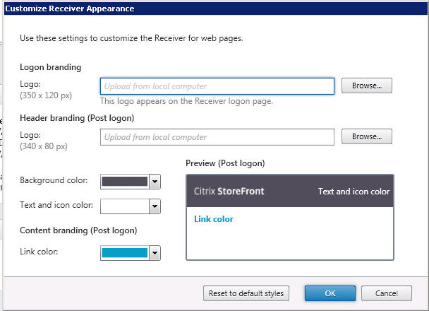
Let’s focus on the logon branding for now. In the StoreFront admin console, change the first box to this:
|
1 |
C:\inetpub\wwwroot\Citrix\StoreDevWeb\receiver\images\2x\CitrixReceiver_WebScreen@2x_464701C52C0B15A2.png |
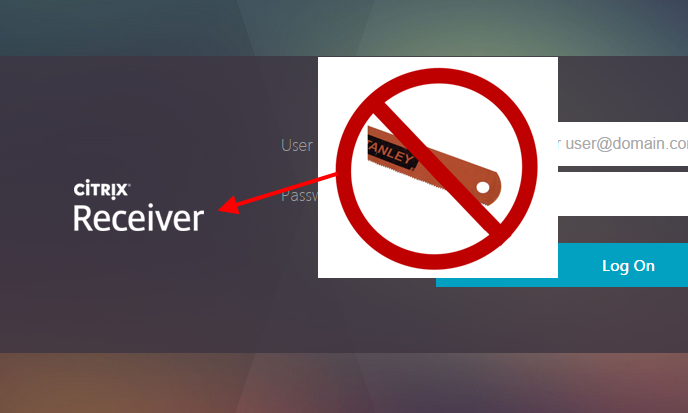
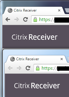
The logo is the right size but the edges are pretty jagged. Compare 2.7, 3.0 default, and the 3.0 custom logo you just set in my screenshot below. Click on the image below for a larger size to compare. Depending on your monitor and your eyes you should hopefully see the difference. Concentrate on the “v” in Receiver where the jaggedness is most evident:
Sorry, most people would be okay with it but my obsessive compulsive disorder can’t stand it. No logo should ever look like the teeth of hacksaw blade if you can help it. StoreFront is resizing the high res 2x logo you just set to a 1x image. There are many different ways to resize an image and the method being used by StoreFront is not as good as doing it in Photoshop manually using one of it’s algorithms (I typically use the default Bicubic but Bicubic Smoother or Sharper may work even better depending on what you’re doing). This goes back to the vector vs. raster conversation if you have ever worked with print or web design. Ideally you want your logo to be a high res vector image like an .eps file that you resize down to the exact size you need for your website and save as a .png which is a fairly lossless image format. But that’s asking a lot of people who aren’t graphics artists or web designers. The alternative is to let the software (StoreFront in this case) downsize the image, but the quality is not as good.
I went ahead and created these custom logos with much smoother images:
Citrix-StoreFront-3-0-Custom-Logos.zip (right click – save as)
There are 4 files in this zip file:
-CitrixStoreFront_auth@2x_custom_Citrix_Receiver.png
-Citrix_HalfLogonLogo.png
-CitrixReceiverLogo_Home@2x_3FEDFD700D66DF42_custom_Citrix_Receiver.png
-Citrix_HalfHeaderLogo.png
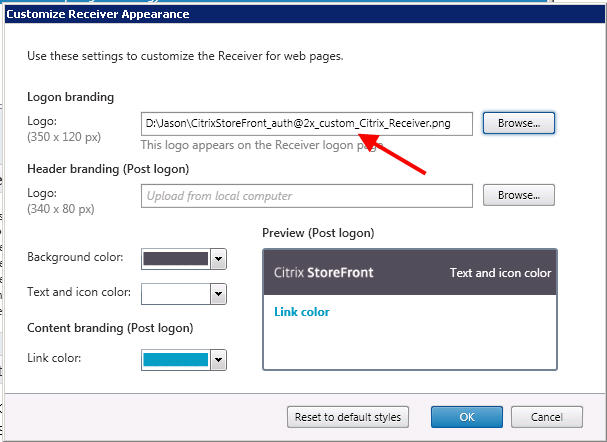
Unzip them into any temp folder. Now change the Logon Logo to “CitrixStoreFront_auth@2x_custom_Citrix_Receiver.png”:
After you upload via GUI it will automatically be copied into:
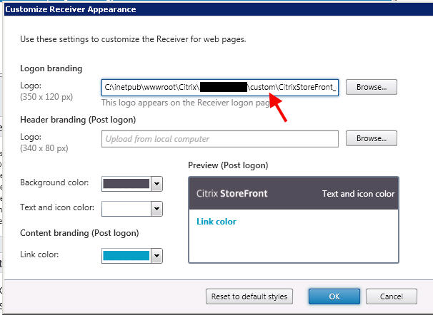
C:\inetpub\wwwroot\Citrix\StoreWeb\custom
That’s where all your custom files go. Don’t believe me? Open the Customize Receiver Appearance screen again and check it out, it’s the new “custom” path:
Open up this location in Windows Explorer and you’ll notice it created a file called:
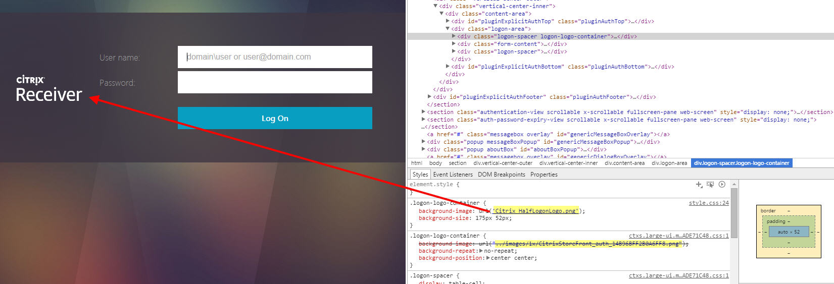
Citrix_HalfLogonLogo.png
This new file is the 1x image and the one causing you all this grief. Don’t believe me? Check out 2.7:
vs. default 3.0:
vs. custom 3.0:
Simply overwrite Citrix_HalfLogonLogo.png with the one that I provided. Now check your website. Voila, no more jaggy sawtooth edges!
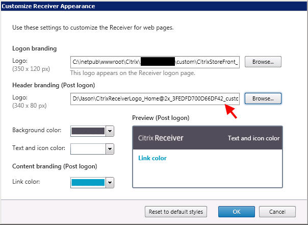
The header logo works the same way. Open up the customization screen and navigate to the new CitrixReceiverLogo_Home@2x_3FEDFD700D66DF42_custom_Citrix_Receiver.png file I provided:
Once you hit okay go ahead and check out your custom folder. There’s a new image called “Citrix_HalfHeaderLogo.png” which is the 1x image:
Overwrite it with the one I gave you. Voila, no jaggy edges here either! Here’s a before and after comparison:
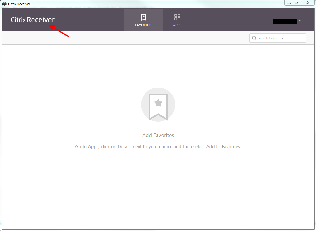
Even Receiver 4.3 sees this change and looks pretty good!
StoreFront 3.0 is still relatively new, the eDocs for it isn’t out yet, and I’m probably doing something wrong so don’t hold me to any of this. The StoreFront Development team will likely kill me for publishing this post. Don’t do any of this in a production environment until you fully test your customizations. Heck, the new mobile Receiver isn’t even out yet so you’re still going to get Green Bubbles on your iPad if you add a StoreFront 3.0 store (iOS Receiver is still version 5.9.6 at the time of writing this article). This is just what I did to get it working the way I wanted (and satisfy my obsessive compulsive disorder). 🙂
Design is not Responsive (“mobile first”)
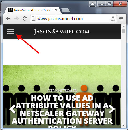
I’ve talked about how StoreFront is not Responsive in the past (https://en.wikipedia.org/wiki/Responsive_web_design) where you design your website for mobile devices first. Citrix is a company that pushes Mobility above all else and it’s mobile devices that are responsible for a lot of this. Sadly StoreFront still isn’t Responsive with 3.0. My website for example is Responsive, just drag the corner of your browser until your screen is the size of your phone. You’ll notice you get the 3 lines and the navigation has shifted over to it making the website very touch friendly:
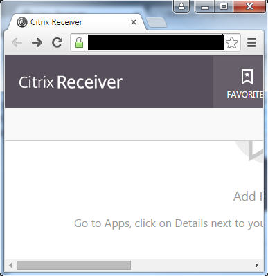
If you try that with StoreFront 3.0, this is what you get:
Not exactly ideal. But hey, the website wasn’t designed for mobile devices anyhow. Mobile devices should be using the mobile Receiver app. If you have a NetScaler, read my “How to force users to use the Citrix Receiver app on mobile devices using NetScaler” article. I don’t like any mobile devices hitting something it wasn’t designed for so like the swiss army knife it is, NetScaler comes to the rescue. 🙂
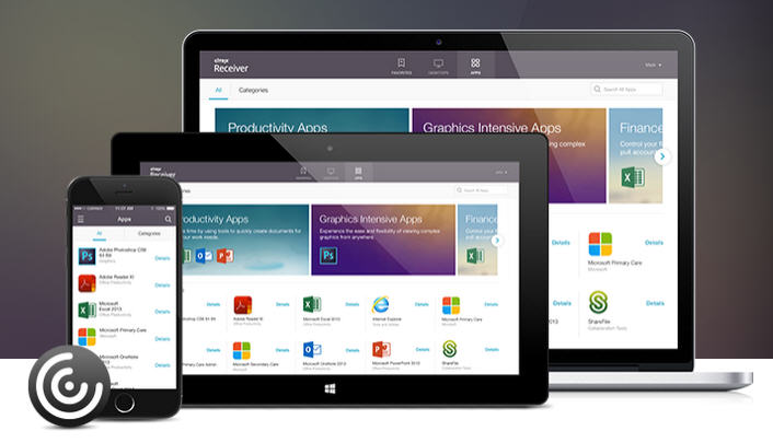
I will say this, I am looking forward to a fully Unified Citrix Receiver experience. Getting closer to the day when everything will look like this:
I’ll post more gotchas and workarounds as I come across them. Please leave a comment below if you have any questions or suggestions. And if you’re part of the StoreFront Development team, huge kudos to you all! Loving StoreFront 3.0 so far! 🙂
Jason Samuel is a visionary product leader and trusted advisor with a proven track record of shaping strategy and driving technology innovation. With extensive expertise in enterprise end-user computing, security, cloud, automation, and virtualization technologies, Jason has become a globally recognized authority in the IT industry. His career spans consulting for hundreds of Fortune 500 enterprises across diverse business sectors worldwide, delivering cutting-edge digital solutions from Citrix, Microsoft, VMware, Amazon, Google, and NVIDIA that seamlessly balance security with exceptional user experiences.
Jason’s leadership is amplified by his dedication to knowledge-sharing as an author, speaker, podcaster, and mentor within the global IT and technology community. Recognized with numerous prestigious awards, Jason’s contributions underscore his commitment to advancing technology and empowering organizations to achieve transformative results. Follow him on LinkedIn.









Hector
July 14, 2015 at 1:04 PM
If you already have customization’s done to the theme in 2.6, does upgrading to 3.0 wipe does changes?
Jason Samuel
July 16, 2015 at 9:47 AM
Sorry Hector, I have not tested that yet and it really depends on what you have done and how it was done. The upgrade is designed to not impact your customizations until you enable the new user experience so I’m assuming whatever changes you have done should persist at least until that point. The best thing to do is extensively test this upgrade process before doing it in live environment. You want to make sure everything you need carries over.
Hector
July 16, 2015 at 9:53 AM
Thanks for the reply Jason. Just to let you know I did the upgrade yesterday and It went beautiful. All my customization was there as I hopefully expected. I disabled the Classic experience to test out the new features. After awhile i was able to enable classic receiver back and I was able to get my custom page back with no hiccups. Really good so far.
Jason Samuel
July 16, 2015 at 9:54 AM
Excellent! That’s great to hear. They definitely put a lot of thought into the administration experience with this release.
storm
September 22, 2015 at 9:25 PM
Hello, I just upgraded my storeFront from 2.x to 3. I am not seeing that nice new non green bubble back ground pictured here. http://cdn3.jasonsamuel.com/wp-content/uploads/2015/07/11.jpg
How can i get that background instead of the 2.x bubble?
thanks
Matt
January 16, 2016 at 1:42 PM
Not the best approach but if you navigate to the srorefront web url on iOS, you will get a nice mobile experience. The issue still remains that you’ll need to follow prompts to open the app (ica file) of your choice with the suggested receiver and then navigate manually back to the storefront.
Michael Yuen
May 25, 2016 at 8:35 AM
Something we noticed in our environment when using the Unified Experience: it breaks Receiver for Windows Mobile. Yes, not many use Windows Mobile Phone, but we are obliged to accommodate the common denominator. As a result, we have to use the Classic Experience. I suspect that the Receiver app on Windows Mobile has not been updated to support the Unified Experience UI after all this time :/
rob
August 16, 2016 at 6:26 PM
Hello,
anyone knows if we can put degree angular lines instead of straight rectangle bar as a header after logon?